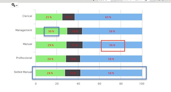
In today’s data-driven era, data visualization holds the key to transforming dense information into clear, actionable insights. An efficient way to represent data is through the use of a stacked chart. These clever statistical tools provide a more comprehensive view of the data, simplifying complex information into an easily accessible format. Understanding how to use stacked charts effectively can enhance decision-making processes in both businesses and other facets of life. Read on to learn more about these underutilized yet invaluable tools.
Understanding the Basics of Stacked Charts
Just like the foundation of a house, understanding the basics of a stacked chart is key to harnessing its full potential. At its very core, a stacked chart is essentially a graphical representation of data in which related values are stacked one on top of the other, forming a single stack. This creates a holistic view of the entirety of the data while still providing insight into individual components.
Using the different segments of each stack, one can identify and assess the specific values they represent. It brings clarity to how individual components contribute to the total sum, marking differences and similarities across various categories. This layered approach offers a multi-dimensional perspective on data, a feature that makes stacked charts highly efficient tools in data visualization.
Moreover, stacked charts are excellent for showcasing trends, patterns, and changes over time. Since each stack represents a point in time and its corresponding data, observing changes between stacks provides a dynamic view of the data evolution. By revealing both the macro and micro aspects of data, stacked charts serve as a robust platform for detailed data analysis.
Types of Stacked Charts
Stacked charts come in different forms, each suitable for a unique set of data. The two primary categories are stacked bar charts and stacked area charts. A stacked bar chart utilizes bars to represent data, with each bar divided into segments that reflect individual data points. This configuration is particularly useful when dealing with categories varying wildly in their total sum, as it affords a comparative view of each category.
Stacked area charts, however, use areas or regions to represent data. Just like their bar counterparts, these areas are split into segments representing individual data points. They are best suited for time series data, as they excel in showing how the overall composition of the data changes over time. By filling the area beneath each segment with colour or patterns, this type of chart visually signals the progression and evolution of data over a specified period.
Despite these distinctions, one thing is common to all types of stacked charts: they all provide a comprehensive view of data in a compact and intuitive format. By knowing when to use each of them, one can greatly enhance the effectiveness of their data visualization efforts.
Practical Applications of Stacked Charts

In terms of application, stacked charts are not sector-specific; they can be used in a wide range of fields, sectors, and industries. For instance, in finance, they can be employed to represent the evolution of an investment portfolio over time. Economists might use them to illustrate shifts in market share among competitors, while social scientists can employ them in tracking population growth or demographic changes.
Moreover, within organizations, these charts act as pivotal tools for enhancing data-driven decision-making. Managers can use stacked charts to track sales performance, monitor supply chain processes, or even help understand employee performance. Essentially, whichever field requires a comparison of individual components against a whole, a stacked chart will prove beneficial.
It is these wide-ranging applications of stacked charts that underpin their usefulness. Regardless of where they are deployed, they allow for detailed analysis and comprehensive views of data sets, thus fulfilling their purpose— making complex data understandable at a glance.
Regardless of your knowledge level or purpose for data analysis, giving stacked charts a try might just revolutionize your understanding and usage of data. From presenting comprehensive sales data to highlighting trends in staffing levels, these simple yet effective data visualization tools can turn complex information into easily understandable, compelling visuals. Data is power, and with stacked charts, you can harness this power like never before.
Also, read this article: Embracing the Future: An In-depth Look at Data Science Tools and Technologies
